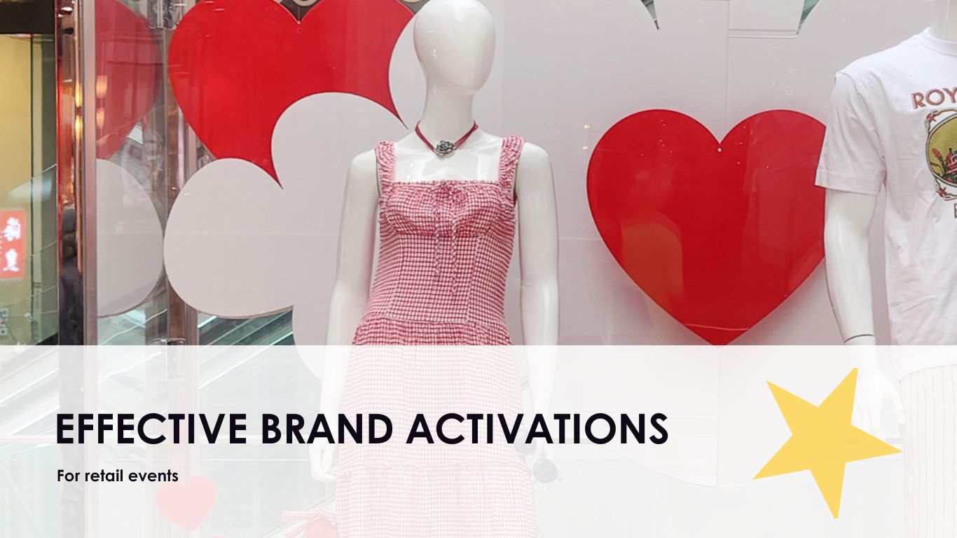
When event planners and brand managers are under pressure to deliver unforgettable experiences, every design choice needs to do more than just look good. It needs to communicate something. A visual display is not just decoration; it is an opportunity to tell a story, spark interest, and reinforce everything your brand stands for. Whether you are working on a window display, a conference backdrop or a seasonal activation, the visual direction sets the tone for how an audience feels, remembers, and engages with you.
Creating a space that reflects your brand while standing out from the noise takes careful planning and strategic execution. Colours, textures, materials and spatial layout all contribute to making a striking first impression. Done properly, a display delivers more than just visual appeal. It pulls people in, speaks to your identity without words, and starts a conversation before a single person greets them. The right build tells your story long before your team does.
Connecting Visual Displays to Brand Identity
A display that misses the mark on brand alignment can distract, confuse or water down your message. When the look and feel of your styling does not match what your business represents, the impact drops immediately. For example, a luxury skincare brand using cheap acrylic props or mismatched colour palettes sends the wrong message; no matter how tidy the setup is.
The starting point is always your brand identity. Every element of the visual should reinforce your tone, values and offering. Here’s where real alignment matters:
1. Stick with core brand colours. Do not bend the palette to fit a current trend unless it complements your primary colourway.
2. Use materials and textures that reflect your product or service. Glass, chrome and florals convey something completely different to wood, linen or industrial finishes.
3. Match the energy level. A high-end fashion house might benefit from dramatic lighting and sculptural elements, while a children’s event activation may need playful props and soft finishes.
4. Keep messages consistent. If your tone is bold and confident, the display should reflect that in scale and presence.
5. Think about how it appears on camera. Social media matters, so your styling must photograph well and reflect your identity in posts with your name tagged.
Clear brand visuals build trust. Your audience recognises consistency and responds to it; even subconsciously. Brand managers know that approvals come quicker and feedback gets better when the styling makes visual sense across all touchpoints. That kind of alignment gives you more than a picture-perfect moment; it gives you control over how your brand is perceived in every space it occupies.
Design Principles for Impactful Displays
A strong display does not always have to be larger than life. It is about using effective design principles that draw attention, hold it, and guide the eye naturally. These elements all work in concert to help people absorb the message without effort.
Start with structure. Balance and symmetry provide order to any arrangement. When working with open floor plans or large windows, mirror designs from one side to the other or use central standout pieces to anchor the layout. This creates a sense of calm and helps visitors feel grounded. For key attention points, odd numbers are often more visually appealing. Groupings of three frequently outperform pairs or clusters of four.
Lighting should do more than just illuminate. It sets the tone. Spotlighting a feature draws the eye instantly. Dimmed borders or soft transitions between zones can create a more fluid and intentional experience. LED filters, warm colour temperatures, or single-source beams help accentuate textures in unique ways and add depth to the environment.
Movement adds intrigue when used intentionally. This could be subtle kinetic pieces, fabrics that catch light drafts, or cleverly engineered props that shift gently. Every element should have a clear purpose. Unfocused or erratic motion quickly becomes a distraction.
Textural layering is another dimension often overlooked. Materials like fabric, timber, mesh, or green elements can create softness or edge. These tactile differences deepen audience connection, particularly when paired with suitable lighting and colour. Surfaces that look and feel interesting hold attention for longer.
Thoughtful, effective design isn’t about chasing wow moments. It is about clarity. Controls like visual hierarchy, natural flow, and spatial rhythm serve the audience without overwhelming them. The display should guide viewers seamlessly from entry to exit while either giving a quiet introduction or making a bold statement that still feels natural.
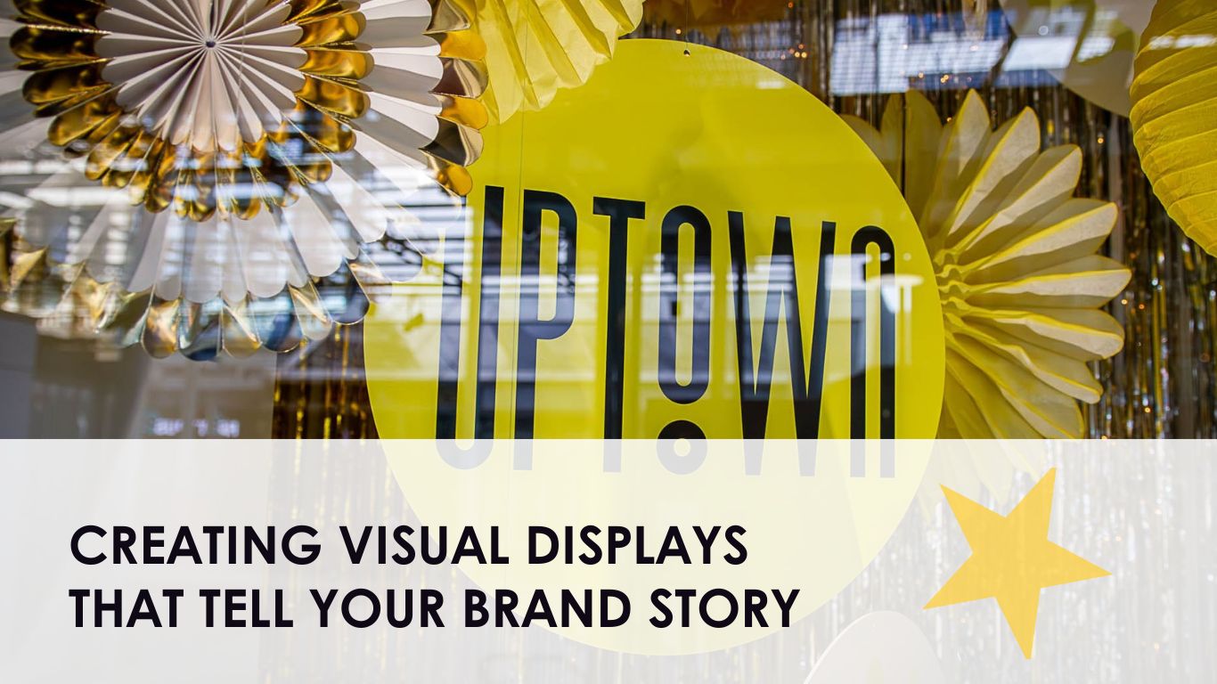
Seasonal and Thematic Displays
Seasonal styling is a chance to refresh a space and boost engagement, but it only works when done with intention. Simply switching to autumn tones or hanging baubles in December doesn't cut it. What matters is integrating those seasonal cues in a way that never obscures your core brand identity. Your audience should know it is you, regardless of the calendar.
Start by choosing an emotional tone. Is the intended feeling warm and festive, calm and wintery, or fresh and energising? That tone should align with your brand’s usual personality. A financial firm aiming to bring festive charm might use sculptural tree silhouettes, refined lighting layers, and soft metallic tones, rather than tinsel or novelty items.
Timing plays a big role in retail and public activations. Too early, and the campaign feels forced. Too late, and the moment is missed. Aim to meet your audience when they are emotionally ready to engage. Subtle audio and scent cues can add dimension, but be cautious. Overdoing it risks undermining the display’s effectiveness.
For successful seasonal visual merchandising, consider the following:
1. Reinforce your brand colours with seasonal hues layered in, not replaced.
2. Avoid tired themes. Rethink the classics, like frosted neutrals or bronze tones, instead of red and green.
3. Add branded touches subtly with engraved tags, customised ornaments or printed overlays.
4. Plan for modular setups. This makes transitions easier across extended campaigns.
5. Choose materials that photograph well, accounting for lighting and reflections within your space.
One notable example took place in a retail precinct where three shops launched their end-of-year visuals. Only one stood out. Their use of glass and soft gold accents with suspended lighting felt premium, matched current trends, and aligned with their brand essence. It generated widespread social media attention and remained relevant with just a single refresh post-Christmas.
The takeaway? Seasonal elements should boost engagement without eroding what the brand stands for the rest of the year.
Measuring the Success of Your Visual Displays
It is easy to focus all energy on building the visual display, but what happens after installation is just as important. Measuring success helps secure future budgets and improves subsequent campaigns.
Success is not always flashy. It might come in the form of higher-quality social engagement, better in-store flow or even internal positive feedback. Building a review process into the display cycle allows these wins to be captured.
Ways to assess visual performance include:
1. Foot traffic comparisons from before and after the install.
2. Tracking social mentions and photography on platforms like Instagram and X.
3. Observing user-generated content. Are customers posing near your display or tagging your brand?
4. Running quick on-site polls or feedback surveys on first impressions.
5. Setting and reviewing clear goals. Was the aim to increase dwell time, spotlight a new product, or boost interaction?
For corporate settings, feedback from leadership can be just as valuable. Recognition from executive teams or department heads often signals whether the styling met its mark. If the goals were not reached, revisit the planning brief and make adjustments rather than blaming uncontrollable factors.
Logistics also play into the final analysis. Were bump-in and bump-out times achievable? Did props or materials wear well over the course of the installation? These lessons inform how future activations can be more efficient and even more durable.
Top-tier styling teams consistently embed review checkpoints in their process. Visual documentation, feedback loops and condition checks help sharpen the next activation. Whether it is an end-of-year corporate function, a flagship store window, or a three-month display in a shopping precinct, each step after the fact helps evolve performance.
Partner With Us for Exceptional Visual Merchandising
Styling isn’t just about how things look. It’s about how people feel when they experience your brand in the real world. From design concept to execution, everything needs to work in sync: storytelling, structure, texture, light, and messaging.
Our approach considers the customer journey, venue requirements, team coordination, and brand recall. We think through every line angle, scale ratio, floor material, and focal point. These hidden details are what result in cohesive styling that creates presence, makes a lasting impression, and earns trust across channels.
Stakeholder expectations are high, and your brand’s presence is on display. Done well, visual styling becomes a message in itself, one that lives on in memory, photos, and performance metrics long after the install is packed down.
To discover enduring success in creating engaging environments, explore how The Prop House Collective can make an impact with merchandising through visual displays. Leveraging our innovative approach, we’ll help you design immersive and strategic setups that leave a lasting impression, elevating your brand presence effectively. Begin a conversation with us to transform your vision into reality today.