We've all been there... standing in front of a retail display that took hours to perfect, wondering why customers are walking straight past without so much as a glance. The products are gorgeous. The concept is solid. Everything looks exactly like the mood board. Yet somehow, it's just not working.
But the difference between a display that looks good and one that actually moves product comes down to psychology, not just aesthetics. Your display has exactly three seconds to capture attention and guide action. The layout choices you make — where you place products, how you create flow, what you highlight first — determine whether customers stop or keep walking.
The most expensive mistake? Assuming beautiful equals effective. Businesses invest in stunning products and premium props... only to sabotage their success with layouts that confuse rather than convert. However, awkward sightlines, cluttered arrangements, confusing themes aren't just design flaws, they're sales killers.
The encouraging news? Most layout problems have surprisingly simple solutions. Small adjustments in placement, spacing, and visual hierarchy can transform a display from "pretty but forgettable" to "impossible to ignore." Let's walk through the most common mistakes Brisbane retailers make and the proven fixes that turn browsers into buyers.
The "Too Much of Everything" Trap
The truth is that cluttered displays tend to make customers feel overwhelmed and walk away faster.
It happens constantly across Brisbane's retail scene. Business owners get excited about showcasing everything they have... and accidentally create visual chaos that repels the exact customers they're trying to attract.
When there's too much happening in one space, the eye doesn't know where to land. Shoppers move past, not through. Your carefully crafted campaign messages become unclear. What's supposed to stand out just blends into expensive background noise.
Warning signs your display has crossed into clutter territory:
-
Crowded product groupings with no breathing space between items
-
Multiple focal points fighting for attention like toddlers at a birthday party
-
Decorative props that add more noise than meaning
-
Too many colours or graphics packed into a tight space
-
No clear stand-out product or message
The result? Customers glance over, feel mentally exhausted just looking at it, and keep walking. Your gorgeous products become invisible simply because there's too much competing for attention.
Here's how to rescue an overcrowded display:
-
Start with your hero piece. This is your anchor. Build out from there, letting it guide the tone of the entire setup.
-
Group supporting elements in smaller clusters. Odd numbers (such as 3 or 5) often feel more natural to the eye.
-
Remove any item that doesn't push the concept forward. Ask: does this piece support the main idea or distract from it?
-
Leave negative space. Empty sections help balance out the busy areas and give the viewer's eye a moment to pause.
-
Use elevation. Placing products at different heights adds structure without adding more items.
Clarity creates impact. You want people to understand the point of your display instantly. If they have to work too hard to get it, they'll simply move on to something easier to process.
When Your Layout Creates Traffic Jams Instead of Sales
The way customers move through a space is just as important as what they see. Yet many retailers accidentally turn their displays into obstacle courses that customers want to escape rather than explore.
If your layout blocks the natural walking route or causes hesitation, your display can go unnoticed or even become something to avoid. The goal isn't just to look good... it's to guide attention smoothly from entry to key zones, leading people exactly where you want them to spend money.
The invisible psychology of customer movement...
Think about sightlines. What do customers see first from afar? What pulls them closer? If your layout interrupts that journey with distractions or barriers, your message may never land. Customers make split-second decisions about whether a space feels welcoming or complicated. And complicated doesn't convert.
Layout fixes that improve customer flow:
-
Avoid creating physical barriers with large plinths too close to the entry point
-
Angle displays slightly instead of arranging them in rigid straight lines
-
Lead the eye using directional elements like floor graphics, lighting, or angled props
-
Place key products or campaign messaging at pause points, such as corners or lift exits
-
Keep main walkways generous enough for browsing and foot traffic
A display that works beautifully from behind the counter might feel completely different from a customer's perspective. What looks spacious during setup can feel cramped when real people with handbags and shopping trolleys try to navigate around it.
The fix often comes down to spacing adjustments rather than complete redesigns. Moving a display stand 30 centimetres can transform a bottleneck into a natural browsing flow.
When done well, customer movement should feel easy and intuitive, offering visual pit stops that keep them engaged without feeling trapped or rushed.
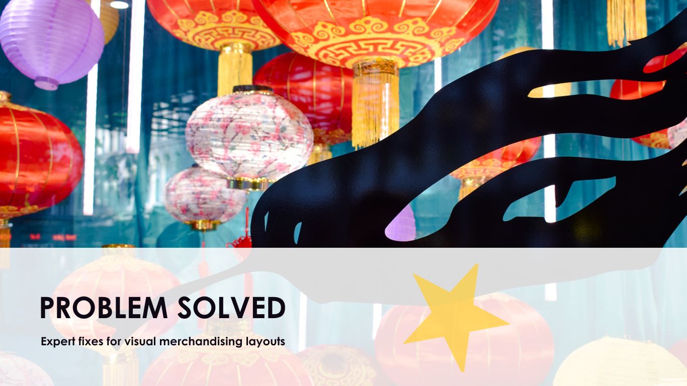
When Your Display Sends Mixed Messages
Displays that lack a clear theme feel scattered. Customers can't pinpoint what's wrong, but they'll sense something is off... and that uncomfortable feeling usually translates into walking away without purchasing.
A strong display should feel unified. Every element, from colours and props to textures and signage, needs to speak the same visual language. This creates the kind of immediate "gets it" response that makes customers stop, engage, and ultimately buy.
That doesn't mean everything has to match perfectly. It means the elements must support the same story. If the backdrop says beach holiday but the products lean winter luxe, the result feels disjointed. Customers sense the disconnect even if they can't articulate why your display feels "wrong".
How to create displays that feel intentionally cohesive:
-
Stick to one clear look and colour palette per zone or campaign
-
Use materials that suit your brand's tone, such as metallics for luxe or timber and linen for relaxed settings
-
Balance consistency with contrast. Some pieces should blend while others pop, but all should feel connected
-
Anchor your theme with one major focal point and build the rest around it
-
Before installation, review all elements through a brand lens: does it reflect your business and photograph well for socials?
When everything feels intentionally chosen and connected, customers unconsciously relax and become more receptive to your message.
The quick cohesion test: Squint from a few metres away. If your hero item doesn't dominate visually, something might be out of place. This simple check reveals whether your display creates clear hierarchy or confusing competition between elements.
When Great Products Look Ordinary Because of Bad Lighting
Lighting controls what gets noticed first. It can transform the energy of a space in seconds. Great lighting can elevate a simple product into something irresistible. Poor lighting can make even the most well-designed installations feel flat and forgettable.
Yet lighting remains one of the most overlooked elements in visual merchandising. Brisbane business owners spend thousands on premium products and props... then let ordinary venue lighting kill the entire effect.
Typical issues include harsh downlights too close to the display, dim corners with no focal lighting, or relying solely on a venue's default settings. Shadows, glare, or mismatched light temperatures all affect the result. Your beautiful display suddenly looks cheap. Your premium products appear ordinary. Your carefully chosen colours shift in ways that feel off-brand.
Strategic lighting fixes that work:
-
Use layered lighting with multiple sources, such as overhead light, spots, and accent lighting
-
Highlight upright surfaces like graphics or signage at eye-level
-
Add up-lighting to add dimension, and avoid lighting from only one direction
-
Choose warmer tones when you want an inviting feel, cooler tones when clarity matters
-
If you're outdoors or in a temporary location, test the light at the hour your target audience will visit
The timing element gets overlooked constantly. Your setup might look perfect at midday but completely different when your actual customers arrive during evening shopping hours. That same carefully crafted display can feel dull or overwhelming under different lighting conditions.
Getting lighting right helps your overall composition deliver its intended message. It's the difference between products that whisper and products that demand attention.
The Details That Separate Good From Unforgettable
Once the major elements are set, the real magic happens in the finishing touches. These final changes often make the biggest difference between an acceptable layout and one that feels genuinely considered.
Many Brisbane retailers get the big pieces right... then rush to open without those crucial last 20 minutes that transform a display from "nice" to "must-have".
The finishing touches that elevate everything:
-
Add texture with natural elements like foliage, fabric, or layered props
-
Walk around the setup and view it from different angles. It should look good from all customer perspectives
-
Reassess height levels. Even a 10cm lift can rebalance the entire space
-
Be mindful of spacing between focal points so they don't compete with each other
-
Keep a few easy-to-place styling details ready for final tweaks after bump-in
At this stage, fine-tuning becomes everything. Those timely adjustments on-site can polish the installation just before customers arrive. The difference between a display that gets a quick glance and one that stops people in their tracks often comes down to these final details.
Why the extra effort pays off...
Displays that are thoughtfully styled from core concept to final detail tend to hold attention longer and photograph far better. In an age where customers share their shopping experiences online, that Instagram-worthy finish becomes free marketing that extends well beyond your physical space.
The goal isn't perfection. It's intentionality. Every element should feel deliberately chosen rather than accidentally placed.
Transform Your Retail Displays From Pretty to Profitable
Fixing layout problems doesn't always require a dramatic overhaul. Often, it's simply about understanding the psychology behind customer behaviour and making strategic adjustments that guide browsers toward becoming buyers.
The difference between displays that look good and displays that actually move product comes down to three critical areas: flow, focus, and finishing. When you address layout flow first, then tighten your visual focus, and finally polish with intentional details, the transformation can be remarkable... even with minimal time or budget investment.
Here's what changes when you get it right...
Visual merchandising becomes more than just product arrangement. It becomes a silent sales team that works 24/7, telling your brand story while guiding customers naturally toward purchase decisions. Every element works together to create experiences that feel effortless for customers but drive measurable results for your business.
Ready to see what your displays are really capable of?
The Prop House Collective has spent 30 years perfecting the art and science of visual merchandising that converts. We understand the subtle psychology behind customer movement, the technical requirements of retail environments, and how to create displays that photograph beautifully for social media while driving real-world sales.
Whether you're planning seasonal campaigns, retail activations, or permanent installations across Brisbane and South East Queensland, our end-to-end styling expertise transforms concepts into profit-driving realities.
Your next breakthrough display is just one conversation away.
Contact The Prop House Collective today to discover how proven merchandising for visual displays strategies can turn your retail space into a customer magnet that delivers measurable ROI.